A close and wonderful friend is starting her first Etsy site and it was my pleasure to help her out and create some illustrations and logo for her new venture. I thought it would be fun to show the entire experience from beginning to end, so I recorded my desktop while I worked.
Captured on tape
Even though I sped up the video, it’s still long (approx. 12 minutes). If you have any interest working in Illustrator or if you just love vectors, the video is can be helpful. Below, I’ll also give an abbreviated break-down of my process. I’ve always enjoyed looking over someone’s shoulder while they worked. It gives me the opportunity to see how other people problem solve and use their tools of the craft.
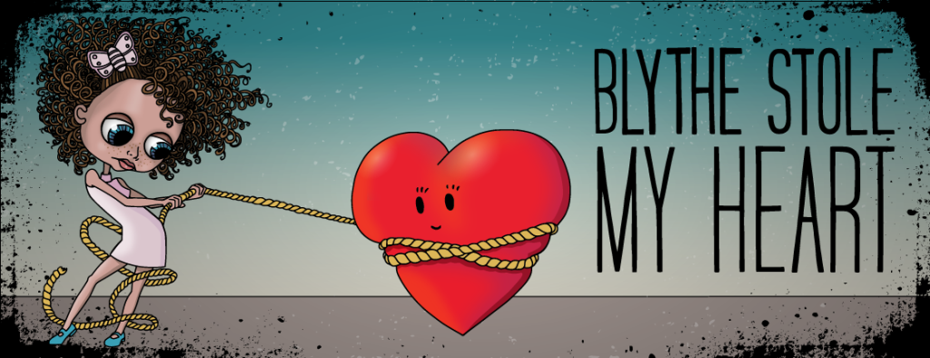
Steps for making Maggie’s art
1. Start with ArtRage for the iPad
ArtRage for the iPad has been my go-to for sketching and pen and ink drawings. Have the app on the iPad makes it portable. Plus the program is wonderfully integrated with the desktop version of ArtRage. In order to get the highest quality image, I max out the canvas size in ArtRage to 2048X2048 pixels.
One of the best features of ArtRage is the pen tool. With the settings, you can adjust the smoothness of the line. For this reason alone, I use it for all my illustration work. You get a perfect line every time!



2. Bitmap trace your black and white drawing in Inkscape
Inkscape is a great vector program for drafting. If you like Illustrator but you don’t want to pay for the CreativeCloud, give Inkscape a try. It takes a little getting used to, but there’s extensive online help and the program has a low ramp-up for becoming a master of the software.
In Inkscape, I import the B&W pen drawing a perform an bitmap trace on the illustration. I’ve found that the tracing capabilities are stronger than Illustrator. If you want to see a side-by-side comparison, I wrote about it in an earlier post. I also wrote a how-to on using bitmap trace in Inkscape.
3. Color art in Illustrator
Although I LOVE open-source software, there are some things that Adobe does that really make my job a breeze. One thing I can’t live without is Illustrator’s appearance palette. With the appearance palette, I can add multiple fills, gradients and blending modes to one object. It’s a great place to experiment away. The paint-bucket tool is also great for filling in line work.


4. Add type
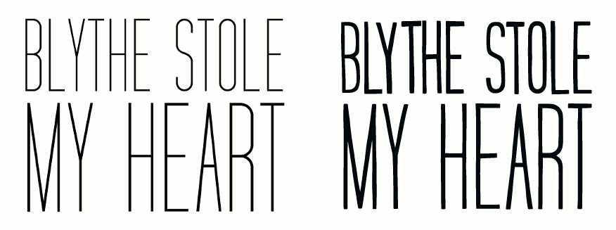
For the type, I just repeated the same hand drawing/tracing process. A lot of times, I find that type looks too “clean” and “sterile” when placed next to my line art. In order for the type and image to feel more integrated, I redraw the type by hand. Sometime I do it from scratch. For Maggie, I traced over existing type. In addition, it gives me the chance to even out the widths of the type since it’s scaled at different sizes.
5. Bring it all together

6. Create logos out of existing elements
Maggie didn’t ask for it, but I thought it might be nice for her to have logo to go along with her illustration. All the assets were already created, it was just a matter of playing a little bit more. Below is a video showing that process.

