How I developed an infographic and didn’t get MERS from a camel
Infographics are a tricky thing. A lot of work goes into looking at data and figuring out how best to tell your narrative visually. The best infographics draw in viewers, giving a strong overview of the info at a glance. Although important, getting your audience’s attention is just the first step. The trick is keeping them engaged and inviting them to go deeper, dissecting the connections between visual elements and how they are related.
I think of creating a good infographic like making a “magic eye” image. For those that don’t remember or mentally block out mall kiosk trends, there was a big craze in the mid 90s for magic eye posters. They tended to be intensely ornate works of “art” that revealed a hidden image if you stared, concentrated, and defocused your eyes. Infographics are a lot like that. There’s a dance between visual aesthetics and data, creating imagery and information that can be appreciated on many levels.
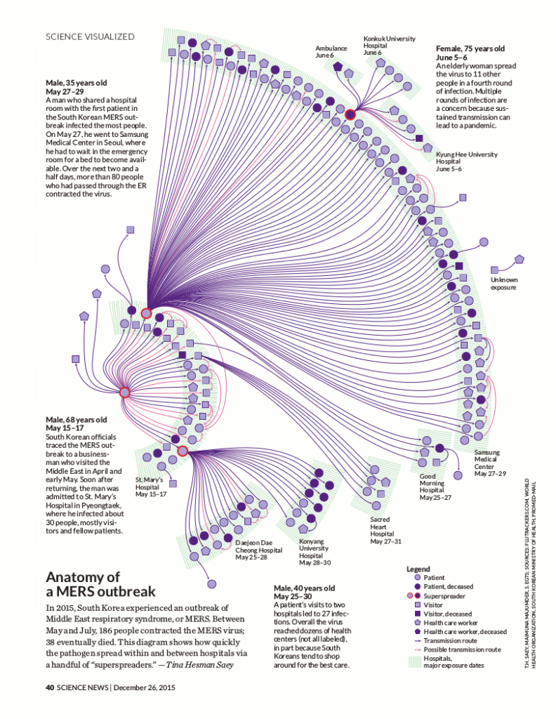
There are some good steps and rules of thumb when creating an infographic. I can walk you through our process of how we created an infographic for a MERS outbreak in South Korea for the December 26 issue of Science News.
Step one: Build a good team
I’m sure you’ve heard the saying, “The sum is greater than its parts.” This couldn’t be truer when creating an infographic. Collaboration is key when you’re interpreting complex info visually. I work at the Society for Science & the Public which publishes a magazine, Science News (SN). The Society’s a science nonprofit where I get paid to get my geek on, every day. It’s a wonderful job and I’m constantly learning.
At work we have full-time staff and consulting resources that include writers, content experts, editors, designers, and fact checkers to make the magic happen.
Your team doesn’t have to be that big for creating a dynamic infographic. It could just be you and a client or a writer or designer. Even if you’re working by yourself, pull in friends and family for input and suggestions. Testing your ideas and visuals at different stages with others helps you understand if your infographic works at communicating the intended narrative.
Step two: Find good storytelling data
One of our SN writers, Tina Hesman Saey, reports on molecular biology and writes about all the breaking news that’s microscopic in scale. Before working with Tina, I never thought deeply about my microbiome, epigenetic impacts, or how CRISPR could eliminate lyme disease. In four years of working closely with Tina, she’s given me a better understanding and appreciation for her teeny cellular universe.
Tina will be the first to tell you that one of her biggest professional perks at SN is tracking outbreaks. She’s unofficially our bug chaser in residence. Tina uses Flutrackers and the World Health Organization’s Disease Outbreak News (DONs) site regularly to keep her current on infectious disease around the world. Last year while using these sites, Tina stumbled onto a MERS outbreak in South Korea on the Flutrackers’ forum.
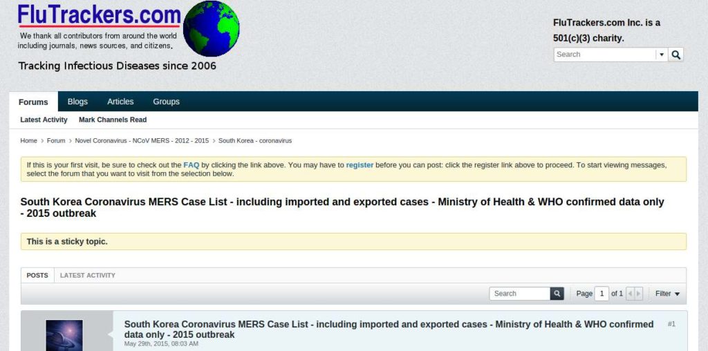
What made this MERS outbreak different than other outbreaks is that the information was truly comprehensive. Not only was there basic patient data, but there was also extensive info on who, how, and where the disease was contracted—leaving a forensics trail of infection.
Others were early to report that patients were jumping from hospital to hospital, infecting a new groups of healthcare workers, patients, and visitors instead of staying in one hospital for treatment. This created a few superspreaders, hopping from each hospital and infecting many. Unlike other reports, Tina the data and the unique cause of infection might lend better to imagery than words for telling the story.
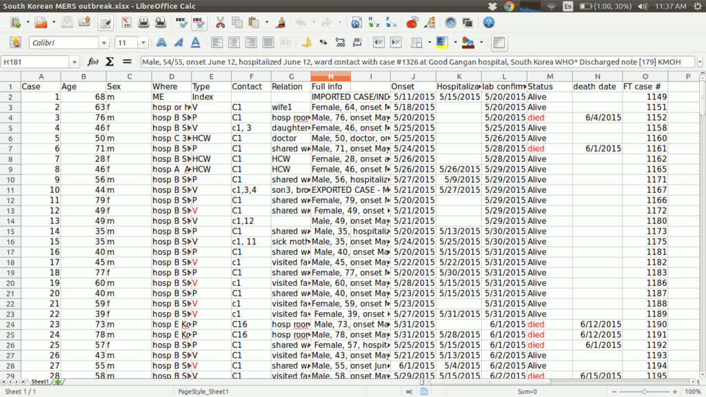
The data was so rich. It was really unprecedented to have this much epidemiological data publicly available. Usually it’s just age, sex and a few other variables, but this data told a very human story. Tina knew it would be a unique opportunity to show how an infectious disease can spread so quickly under the right conditions. She created a spreadsheet from the data to see the links and connections would tell a compelling visual tale.
Step three: Spitball data with a visual team but invite an editor for a reality check
Tina spoke to Andrew Grant, an SN editor, about her findings and how it could be more compelling to tell the story visually rather than writing a standard news article. Andrew called a meeting with me (the visual designer) and Tina to discuss possibilities. While Tina was researching the outbreak data, she came across another researcher, Maia Majumder, who was also reporting on the outbreak with her own data and creating infographics. We invited Maia to work on the project and she was part of our kick-off meeting.
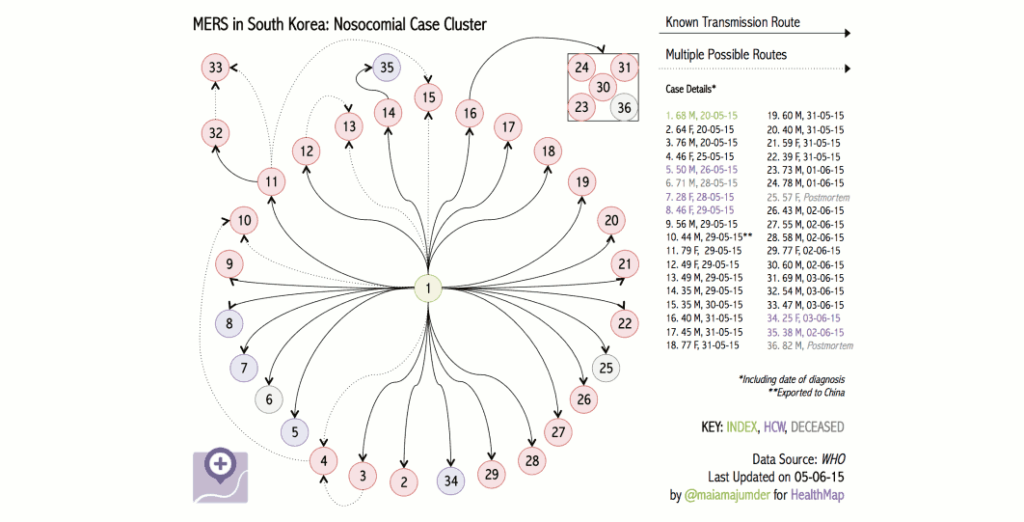
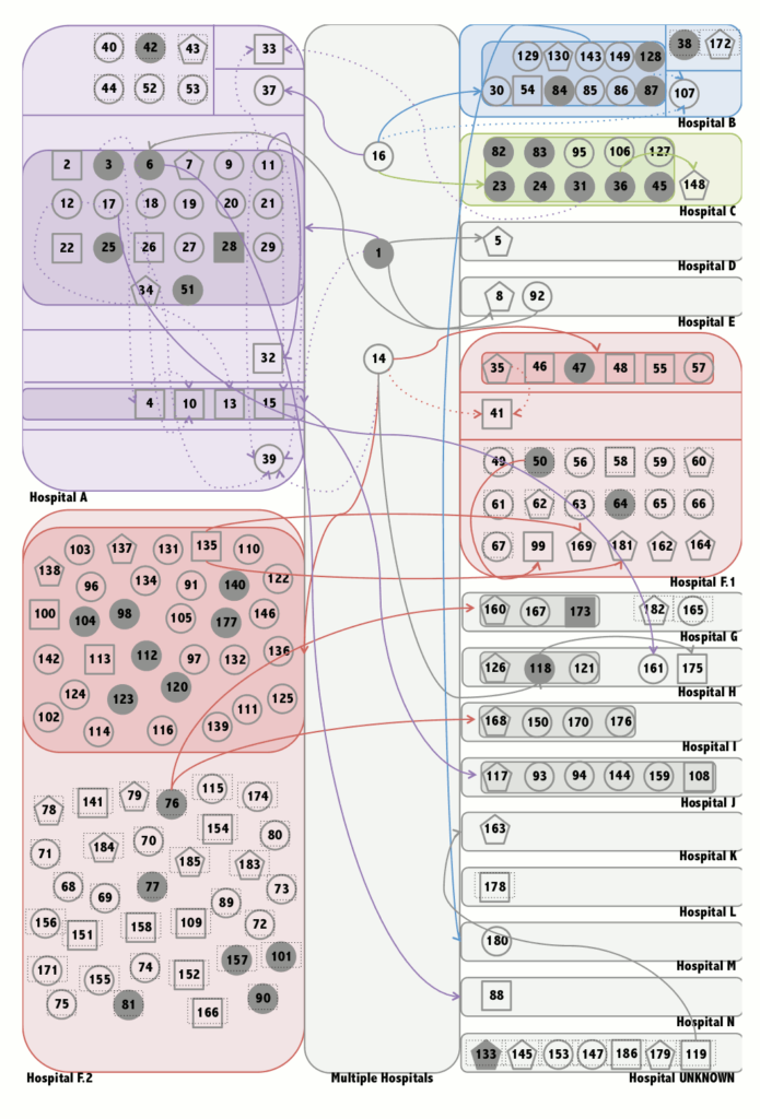
In the meeting we talked about the unique transmission via hospital hopping being the hook of the story. The problem was that there were 186 individuals who contracted MERS. It was a lot of data points to track and figure out the relationships between each other. Tina and Maia were tasked with combining their data and mapping how how each person was affected and related to one another. Tina already knew that there were superspreaders of the disease, but we wanted to make sure that the idea of a few individuals infecting hoards of people by switching hospitals mid treatment could be supported with all the data.
During the meeting we talked about different types of mediums that we could use for storytelling outside of creating an infographic. There was a possibility that the data wasn’t strong enough to visually support this idea of hospital hopping. If that was the case, we would need alternatives. An explainer video and interactive timeline ideas were investigated as possibilities. Even though everyone wanted to create an infographic, the team realized it may not be the best solution and we needed to wait and see what the data showed us.
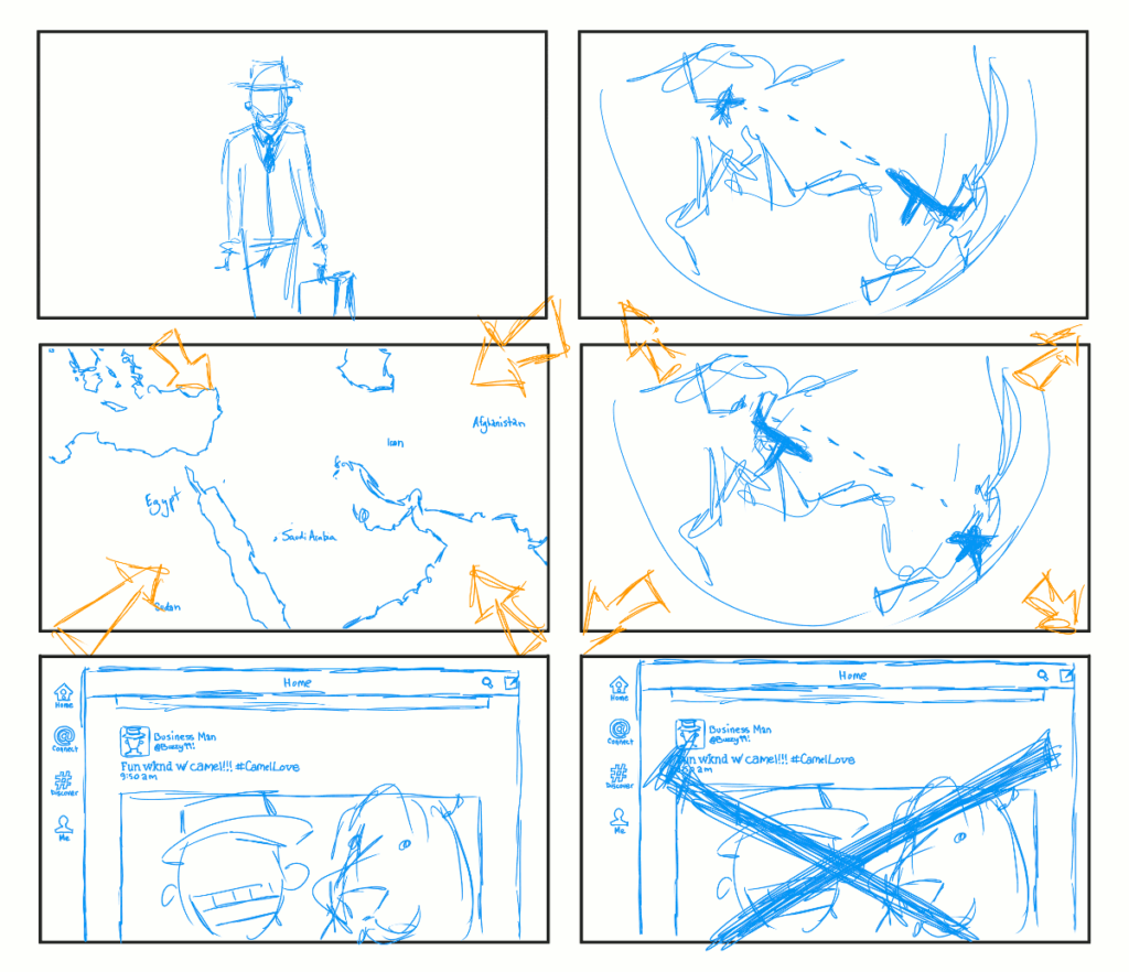
Before we disbanded as a group, we made decisions on what information was important in telling our story. We cut out superfluous data like age and sex that was interesting but not compelling to explaining the unique nature of the outbreak. Limiting the data helped Tina and Maia focus on what we needed.
Step four: Design that data
Before we could start making the infographic look good, Tina and Maia combined their data and created a rough visualizations. They were wireframes that helped confirm Tina’s hunch on how the disease spread.
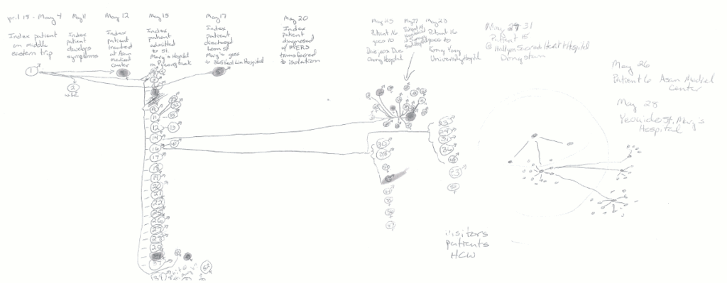
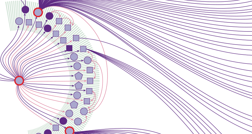
I took the rough sketches and got worked out a linear design mapping all of the connection.
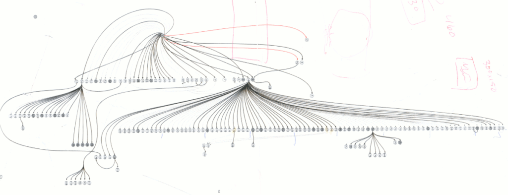
(Image of linear design)
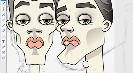
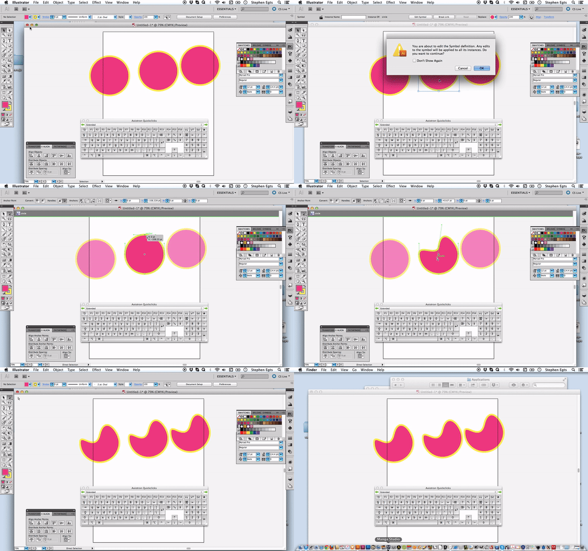
I relied on Adobe Illustrator as my tool of choice to create the design. One of the benefits of using Illustrator was the ability to create symbols out of the shapes used in the design. Each shape designated a specific type of infectee—patient, healthcare worker, or visitor. Making the shapes symbols gave me control when editing. If I needed to change the shapes’ size or color, I could edit one symbol and it would affect all like shapes globally.
Creating a Symbol
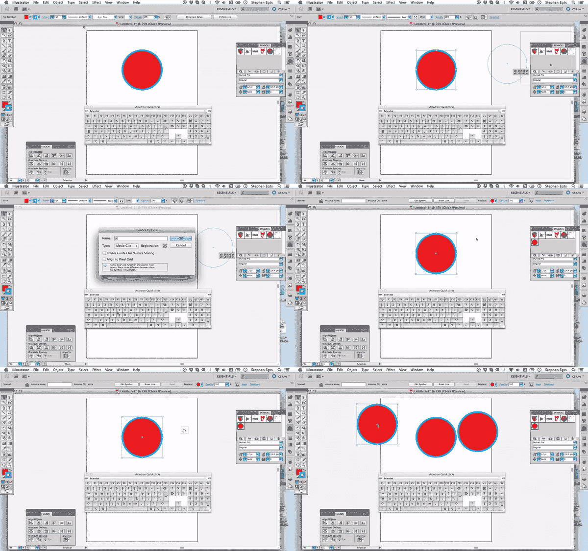
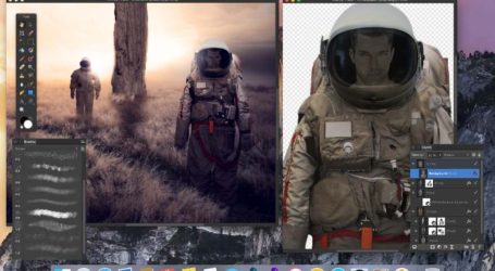
Editing a symbol
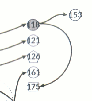
Each of the cases was grouped with its case number so that editors and fact checkers could proof all the data points. Once the design was closer to final, I selected all the numbers and moved them to their own layer in Illustrator that I could hide and make visible in case they needed to check the accuracy of any individual case.
The design needed to fit into an 8” x 10” format for print. Of course, the vertical design that I did to layout all MERS cases wasn’t going to work. To make the design fit within the space, I decided to convert the hospitals from straight lines of data points to arcs. For hospitals with more infected, I doubled the width of the arc. Spacing the shapes on the arc was a snap using an old-school duplication trick.
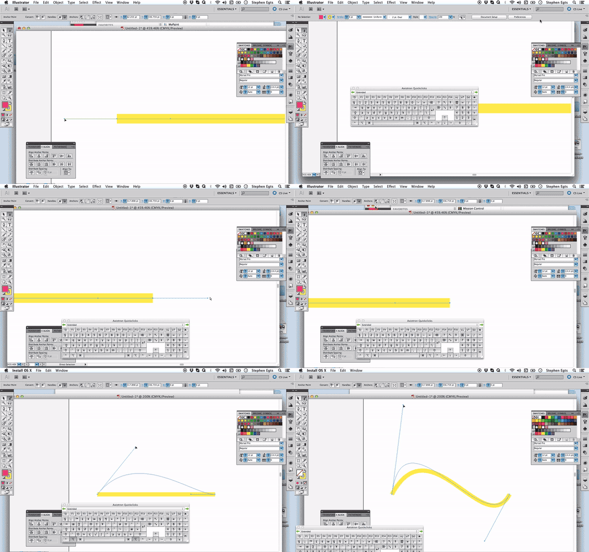
The connecting lines were simple. To achieve a nice curved shape for the line, I created a line with only two bezier point. The bezier handles gave me the ability to create a quick sinewy line.
Simplifying a curved line
To group hospitals together, I came up with a solution playing around with Inkscape, a free alternative to Adobe Illustrator. A feature unique to Inkscape is the ability to create arcs from circles. I did have problems having Inkscape read an Adobe Illustrator CC svg properly, so I only tested my idea with an eps. In the past I didn’t have problem moving between the software, but for some reason using both wasn’t in the cards. The eps that I brought in was readable but it came in at the wrong size. Using Inkscape quickly let me see if grouping the hospitals’ cases with arcs would work.
When you draw a circle in Inkscape, you need to hold down the Control key to draw a perfect sphere. It’s a wee bit different than holding the Shift key for Illustrator, but it’s the same idea. Once you draw the circle, you’ll see a small circle on the edge of the shape. If you drag the tiny circle to the left, the circle will open up and create an arced line—bingo bango! It’s much easier than drawing an arc from scratch or cutting an arc out of circle in Illustrator.
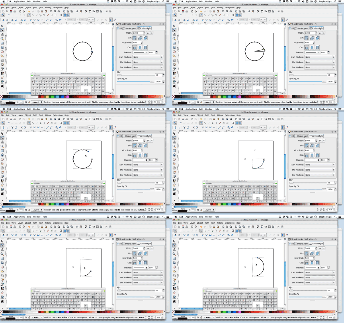
Once I drew the arc, I was able to quickly adjust the thickness of the line to see what worked best.
Jumping back to illustrator, I created the circles quickly and made the arcs thick lines. I wasn’t completely happy with the result when they were all in because the hospitals’ arcs looked heavy and were visually distracting from the patterns formed by the infected. My solution was to make the thick line dashed so that it would become more of a pattern than a heavy solid shape behind the data points.
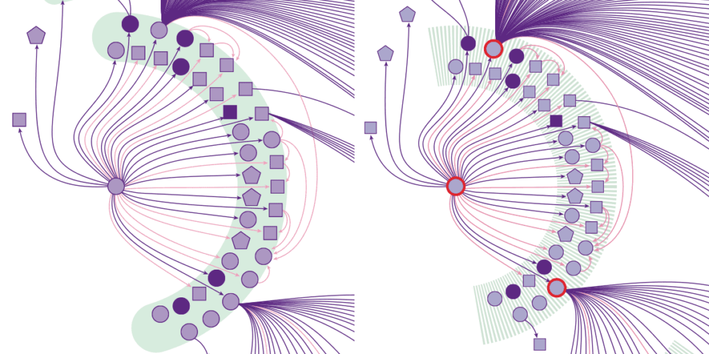
(Thick arcs compared to dashed arcs)
Step five: Proof it
When the design was complete, the infographic went back to Tina, Maia, and a freelance fact checker, Amy Maxmen, to ensure the accuracy of the data. This is the most important part of making an infographic. Your beautiful visualization can easily be voided if there are any errors in your data. These three brilliant women spent countless hours confirming each individual case’s information. They worked separately and together to close the loop on any content that may be in question.
Step six: Release your baby to the world
With the blessing of Andrew and our Editor in Chief, Eva Emerson, weeks of planning, plotting, design, and checking goes live online and in print. Helen Thompson and Kate Travis, Science News’ digital team, did an amazing job at translating the print version from online. They worked with Tina to add more info to the story, making the online infographic a richer experience.
Thanks so much for everyone that enjoyed the story, and I’m looking forward to more collaborations with Tina and the editorial team in 2016.

