Adobe Illustrator Live Trace Vs. Inkscape Trace Bitmap
Tracing Images
Tracing bitmaps in a vector program like Illustrator or Inkscape can give mixed results. To ensure a good outcome, remember to trace from an image that has a lot of pixel info. The more pixels in the image, the more the program has info to pull from in order to make a satisfactory trace. It reminds me of a saying that I learned in video production, “Crap in/crap out.” So don’t expect good results from small images or logos grabbed from online.
Comparing the Two Programs

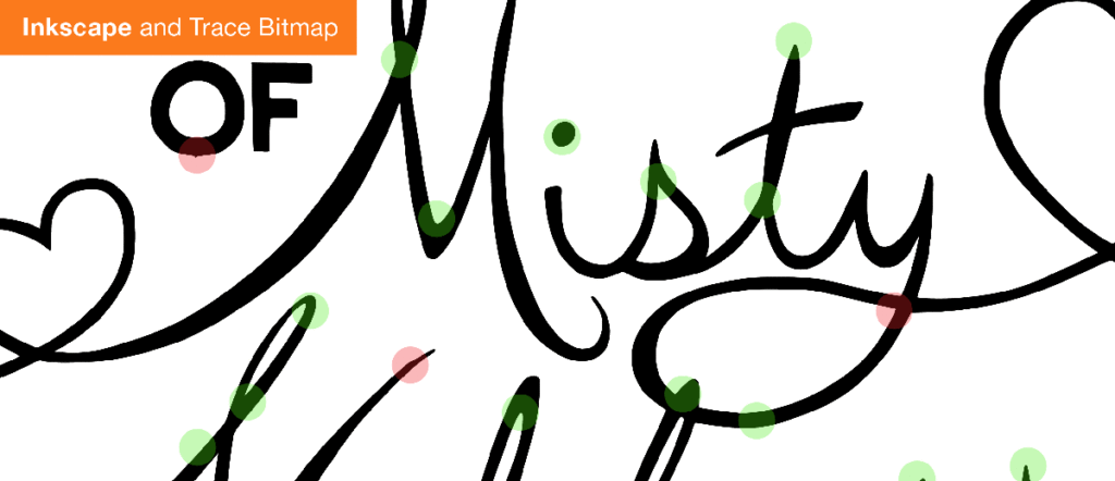
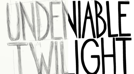
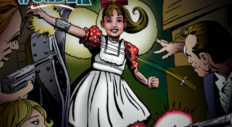
For my new project that I’ve been working on—The Undeniable Twilight of Misty Nikkers—I’ve been trying to use as much open source software as I can in order to create my work. I’m trying to see if I can try to not use any Adobe products. Many people in design feel as if Adobe is the only solution for creating work. I think that’s short sighted and there are a ton of great resources that actually have more advanced features than Adobe. Personally I can attest that it isn’t easy weening yourself off Adobe. After decades of using their software, I have a little voice constantly telling me, “Why learn something new when you can make it quickly in Adobe.” The learning curve I think becomes a deterrent for many. Finding time to learn something new or even wanting learn anything new helps give Adobe an edge.
For the art that I traced, I created it in ArtRage on the iPad. I was curious to see if the image size would be large enough to create an acceptable trace. 2048 x 2048 maximum image size for the ipad version of ArtRage. It did well in both programs.
Illustrator vs. Inkscape
Both Inkscape and Illustrator did a good job in the trace. The line quality overall in Illustrator was a little more wobbly than Inkscape. For the test, I tried to make the tracing as close to apples-to-apples possible. In Inkscape, I dropped out the background and left the default settings in place. In Illustrator, I started with the ‘black and white logo’ preset to make it similar to Inkscape’s option to drop the background. One of the biggest plusses for Illustrator is that you can move the threshold and minimum area sliders and see the trace update on the fly. The interface for Inkscape is much clunkier and it’s difficult to see the small preview created and what is changing. So for Illustrator I was able to tweak and get the best line quality possible, whereas Inkscape was trial and error by applying the change and seeing if it worked.

One thing I found frustrating about Inkscape what that you couldn’t easily go back to the default settings with the click of a button. The only way you can reset the parameters for tolerance and other options would be to open a new file and start over. I was really longing for a button to click to restore the default settings. Another issue I have with Inkscape was that there is room in the interface to explain what each of the parameters that you can select or adjust actually does. Just a sentence in relatable English and not engineering jargon would be awesome. I found myself just clicking buttons and changing numbers without knowing what would possibly happen. Since they already have room with the large dialogue box that appears, help a user out by including what different parameters accomplish—kind of like Photoshop’s masking palette in CS4.
Changing the tolerance in Inkscape was tricky. I was trying to resolve a few of the hiccups in the tracing, but even adjusting the tolerance a little would give my drastically different results. I will give Inkscape the benefit that it was the first time that I used the tracing portion of their program and didn’t review any documentation before trying it out. Also, in the picture of the dialogue box that I included, you can see that the preview image is super small. I tried but was unsuccessful at enlarging the preview so that I could review the line quality. So as far as interface, Illustrator is definitely in the lead.
The Results
The results really speak for themselves. Both Inkscape and Illustrator did an adequate job, but Inkscape in my option was far superior, especially where lines intersect or change direction. Now, this is with the preset results and no messing around like I did in Illustrator. If Inkscape can improve its interface and explain parameters better, it will be a far better tool. Even though the interface is crucial, the end results are ultimately what interests me. You can see that there are a few glitches that I have to correct in the Inscape version, but overall they are minor to the amount of clean up that I would have to do with Illustrator. Click on the Animated Gif comparison below. You’ll be able to see close up the results and the difference. Illustrator has always created a slightly melted looking result. Look at the ‘F’ in ‘OF’ on the animated comparison to see what I mean. Now, Illustrator is a fine program and it excels in the interface, but it falters in the final results and the price! If you are interested in trying it out for yourself. Check out this video tutorial. It should tell you everything you need to know.


Like you noticed too Adobe has much better interface. Working 8 hours a day with InkScape could be pain.
Luckily my boss pays bill and I use CC at home too. Also CS6 had new tracing engine so it could be time for rematch.
I never had problems with drawings but the place where Illustrator was really strugling was geometrical shapes. It seems much better now.
Ville. Thanks for the comment! I haven’t tried CS6 or CC yet. I’m curious to see the improvements. I really like building logos and drafting in Inkscape but you’re right, it takes some getting used to:)
I have CS6 and Inkscape. Inkscape still does a little better. Entirely too much tweaking has to be done to get comparable results in Illustrator. Unfortunately in order to get all the perfect results I want, I’m forced to keep both. The same holds true for CS6 in PhotoShop and Gimp for photo retouching and manipulation. Gimp has some very necessary features for retouching skin that PhotoShop does not. And the airbrush in Gimp feels nicer to me as well..always has. All-in-all if you have a tight budget that does not allow you the high price tag for Adobe products, Inkscape and Gimp are fantastic alternatives and good for starting your career. Upgrade as you progress, because time in interface does become an issue as jobs increase. Then keep ’em both like I do!
I have the same struggle. I’m trying to make it an effort this year to exclusively start using open source over Adobe. I’m also using other paid alternatives. I think there are lots of options out there for us and it’s only getting better. I agree though with breaking from my efficient workflow in Adobe. Inkscape has wonderful drafting functions, but some of the usability like selecting same fill or stroke is kind of hidden.
I have done some professional logo design work in Inkscape and I love its trace feature. What I found to be a good workflow is creating the logo or lettering in Blender where I have much more control over scale/rotate/etc transformations, then rendering at a very high resolution in b&w and tracing in Inkscape. If it is for font or web use I will clean up any redundant points in the trace to optimize it. I agree with you that the preview window could be better and I wish we could zoom it. The settings aren’t as complicated as they look though – notice there are two trace modes and three methods to choose from within each. Basically try one of the three methods and tweak until you get what you want.
Some approaches that have worked for me…
Black and white text or line art:
Single Scan. Color quantization: 3 Colors. Invert if needed.
Color artwork:
Multiple Scans. Colors method. Smooth setting is case by case. Stack Scans. Remove background if desired. Set Scan count higher for smooth gradients or lower for a block print look.
Nice! I would love to look over your shoulder while you work. Do you have any videos online? I’m especially curious how you use Blender. It would be great to see in action!
One costs money one doesn’t nough said!
I favor Inkscape over Illustrator, hell even Photoshop over Illustrator. I find working in Illustrator makes my head hurt, its like playing with knobs and switches to produce art. And believe me I’m coming from the 3D world which makes infinitely more sense to me on the general scale.
With that said I have seen art produced in both Illustrator and Inkscape, I am baffled at the amount of hoops people go through to produce 2d stills from a blank canvas in Illustrator. Worse yet 30% of it gets exported to Photoshop just to get things done right. In Inkscape I Have seen art made in just one app, fully colored and didn’t take a whole day to produce. Says much about quality when comparing apples and oranges.
Just head over to: http://www.deviantart.com/
See for yourself!