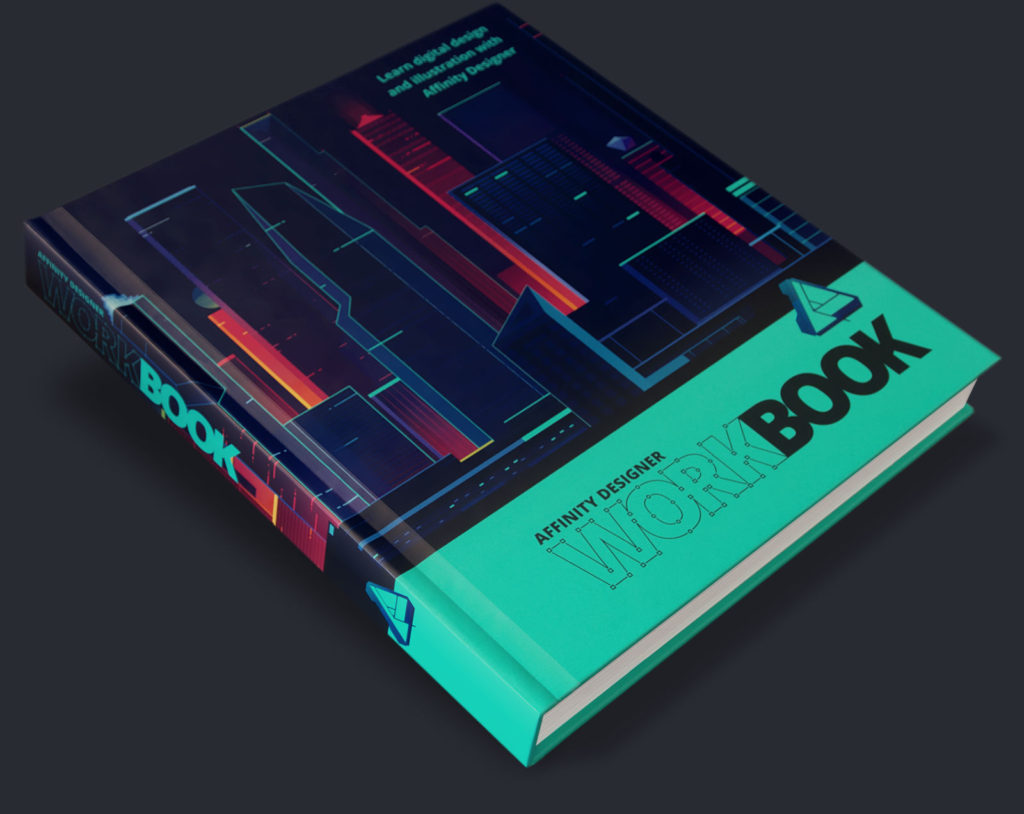
In October, Serif released the Affinity Designer Workbook along with the launch Affinity Designer 1.5. The book is essential for beginners and seasoned vector art professionals. It covers the basics, tips for creating art, and the new featuresAffinity 1.5 offers.
A heavy stocking stuffer
The Workbook is over 400 pages and packed with tons of full-color art and info. The book starts with covering the basics and terminology of Designer. The second part is dedicated to step-by-step tutorials written by artists. The tips and workflow ideas presented reinforce Affinity Designer’s strengths, building an impressive case for including Designer to your daily toolset.
Big things that i learned
The biggest takeaway from reading this book was for me to stop comparing Affinity Designer to Adobe Illustrator. Both tools have their own benefits and approaches to vector art. Like many others who start using Designer, I started using Designer’s tools like I use Illustrator. Reading this book taught me that like different spoken languages, each software has its own approach and there’s something lost when you try to make a direct translation. “Mon petit chou” doesn’t literally mean “my little cabbage” in French. If I want to use Designer as an Illustrator replacement, I learned that I couldn’t treat them as if they’re identical twins.

With detailed examples of creating art in the artists’ own words, the Workbook captures the power of Designer and let’s you into how top artists use it successfully. Each chapter is dedicated to a different artist and all assets/files are available for download so you can follow along with this step-by-step approach.
Here’s a list of things I’ve learned so far:
1. Affinity’s split Personas
Affinity comes with three Personas. Basically, each Persona is a workspace with its own tools. There’s Draw, Pixel, and Export Personas. Each Persona is what you would expect from their name. You edit and create vectors in Draw; paint and edit pixels in Pixel; and export different formats in the Export Persona.
One artist that shows the benefits of using Persona’s is Paolo Limoncelli. Paolo demonstrates how he uses Designer to create a hybrid vector and raster painting. It’s impressive to see Paolo start his initial sketch in Pixel Persona using the raster brush tool. Then he switches over to the Draw Persona to create the vector elements of the scene. What’s really interesting is seeing how Paolo uses both vector and raster brushes in the two Personas in his work. Normally, I don’t mix raster paint and vector together, but Paolo’s approach was really inspiring. I really look forward to creating something in Designer from sketch to final effects.

Both Affinity Designer and Krita offer strong vector and raster tools in the same software. Krita made vector art features a focus in their 2016 development with a Kickstarter. It’s nice to see software developers blurring the lines between points and pixels. It makes artists workflow easier.
2. Vector noise
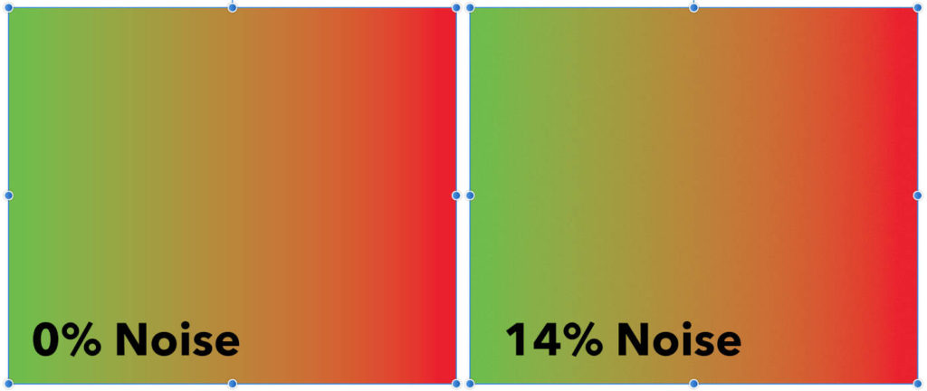
There are tips for creating gradients to prevent banding between colors. Affinity Designer was designed with an intuitive user interface and most features/options are visible on the surface. Reading the Workbook, I learned a little hidden secret. If you click on “Opacity” in the Color Panel, it switches over to “Noise” and you can add a little noise to your gradient, preventing banding. I loved this feature.

Adding the noise to the Color Panel is brilliant and makes it easy to tweak gradients in a snap. One new feature I’d like to see is the option to add a little noise on top a the gaussian blur effect. When I was creating art, I was wishing that I could add a little noise to shapes that I blurred.
3. Eyedropper tool vs. Paste Style
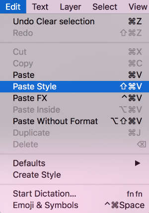
When I first started using Designer, I was bothered that the Eyedropper tool didn’t behave exactly like Illustrator. At first I was trying to use Designer’s Eyedropper tool to copy appearances and gradients from one shape to another. In Designer, the Eyedropper only selects the color that you hover over. I learned from reading the book that you can copy and paste styles (like gradients) or effects which is separate from the Eyedropper Tool. The quick keys for pasting a style to a shape was committed to memory when I tried it out in an illustration.
4. Masking made easy
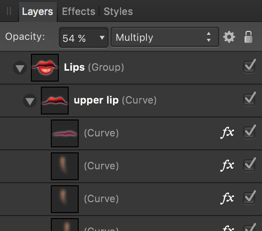
The most mind-blowing aspect of Designer is masking. If you have ever worked and managed clipping masks in Illustrator, I’m sure you have spend most of your day “releasing”, editing, and remaking clipping masks. The Workbook shows how masking is as easy as dragging a layer into another layer in the Layers Panel. There is no mystery to masks when using Designer. This was such an a-ha moment for me. It’s such an easy way to manage multiple masked shapes and you can visually see the hierarchy in the Layers Panel. This is amazing for me! Once I learned this, I was demonstrating for any of my friends who would watch it.
Giving Designer a workout after reading Workbook
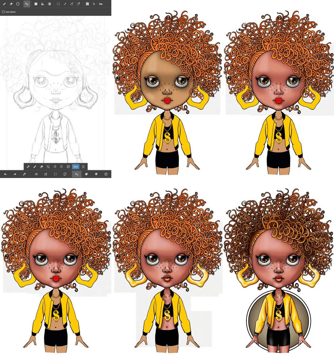
The best way to see if a program is right for you is taking it for a test drive with you personal work. A friend asked me to make an illustration earlier for her in November. I thought it would be good to see the differences in the software because I created a drawing in Illustrator with a same character a few years ago.

For both illustrations, I created the line art in a paint app on a tablet. For the new drawing I used Medibang Paint on my Android tablet. Since Designer doesn’t have a trace function, I traced the line work in Inkscape. I’ve never been a fan of Illustrator’s tracing ability, even with their completely remastered tracing tool in Creative Cloud. Inkscape has always given superior results for tracing artwork and you can’t beat the fact that Inkscape is FREE!
One thing that’s different from my previous Illustrator drawing is that there’s no Fill Bucket tool in Designer. This is one thing Illustrator does well. I used Inkscape as an Illustrator substitute for creating art with filled shapes. To improve Inkscape’s results, I “grow” the fill area so that it doesn’t leave empty areas. Another trick for Inkscape is to zoom in to the art for a cleaner fill. It would be nice to see Designer add a paint bucket tool in the future and there has been a lot of discussion about it on their forum.
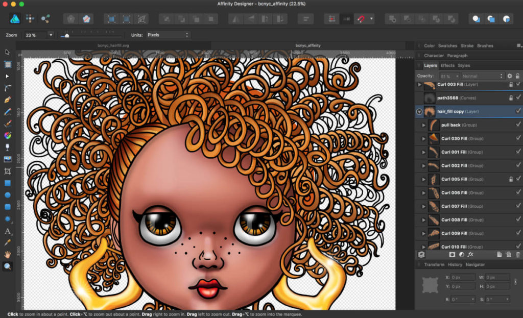
I imported the base fills to Designer where I created all the gradients and final effects. What really impressed me about using Designer was the ease of creating, editing, and managing hundreds of complex masks and being about to see them at a glance in the Layers Panel. You can see the comparison between the Illustrator art I did versus working with masks in Designer. I was able to experiment and work faster in Designer, resulting in richer results.
Final thoughts and a big thank you
I can’t thank Serif enough for a review copy of their Affinity Designer Workbook. It was really enlightening to look at Designer for it’s strengths instead of constantly sizing it up to other comparable software out in the market. If you are seriously interested in using Affinity Designer, then this book is a must and is worth every dollar. It’s not too late to ask for it for Christmas!
There are things that currently not available in Designer like a “same fill” selection or graphing tools, but Workbook explains all the amazing features that are available and unique to Designer. If you are interest in particular feature to be included, then participate in Affinity’s forum and let your voice be heard.
After reading Workbook, I’m convinced Designer is going to be a tool I’m going to rely on heavily in my professional work for 2017.


Segtsy, your review is so much better than I could ever do. After seeing your’s. You nailed it!
TechniSmart on Affinity forum
Thanks so much! That really means a lot! 🙂